
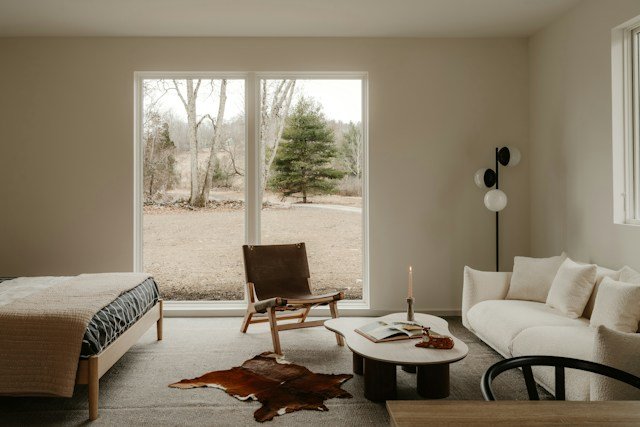
A practical guide to making a single room feel calm, open and genuinely usable, without turning it into a showroom you are afraid to touch.
Stand in the middle of a studio apartment and count the steps. Seven from the bed to the front door. Three from the front door to the stove. Maybe five from the stove to the desk, which is also the dining table, which is also where the mail lands. In a one-room home, everything you own is in the same field of view at the same time. There is no spare bedroom to absorb the boxes, no hallway closet to swallow the coats, and no door to close on the mess at the end of a long day.
That is exactly why minimalist design and studio living fit together so well, and also why so many people get minimalism wrong in a studio. They read about white walls and bare surfaces, strip the room down until it feels like a waiting area, and then wonder why it is uncomfortable to sit in. Real studio apartment minimalist design is less about owning almost nothing and more about making every object, and every square foot, earn its place in the room.
This guide is written for people who live in one room and want it to feel calm. It covers how to map the space you actually have, how to divide a single room into zones that work without walls, which furniture pieces are worth the floor space they take, how to use light and a small number of colors to make the room feel larger, and the mistakes that quietly make small spaces feel smaller. It is not about buying a particular look. You can follow almost all of it with furniture you already own.
Minimalism in one room is a different game
In a large home, minimalism can be an aesthetic choice. You can leave a wall empty because you have six other walls. In a studio, every empty surface is doing real work: it is the place your eye rests, the place the room breathes. So the question to ask is not “how little can I own?” but “what does this room need to do, and what is getting in the way?”
A studio has to be a bedroom, a living room, a kitchen, a workspace and an entryway, all at once, and it has to switch between those roles several times a day. That switching is the real design problem. A bed that is perfectly fine at 11 p.m. becomes visual clutter at 2 p.m. when you are trying to work. A desk that is lovely during the day starts to feel like a to-do list staring at you while you try to fall asleep.
Good minimalist design in this setting solves for those transitions. It tucks things away, lets other things double up, and makes sure the room can look settled in every one of its roles. Once you think of the room as a sequence of scenes instead of one fixed picture, the decisions about what to keep, move or let go get a lot easier.
Start by drawing the room you already have
Before you move a single piece of furniture, draw the room. It does not need to be a proper architectural plan. A rough sketch on the back of an envelope works, as long as you mark the fixed things: the door, the windows, the radiator or vent, the kitchen counters, the bathroom door, and any outlets you rely on. Then write the real measurements on it with a tape measure, not a guess.
This ten-minute exercise reveals things you will not notice by eye. You might find the walkway from the door to the window is three feet wide when you assumed it was four, which explains why the room always feels pinched. You might notice that your sofa is blocking the only wall with an outlet, or that the best wall for your bed is also the one the door swings toward.
A starting sketch. Your own room will be a different shape, but the logic of the four zones carries over.
Once the sketch is done, tape it to a cupboard door or keep it on your phone. You will refer to it more than you expect, especially when you are tempted to buy something “that will probably fit.” If it does not fit on the drawing, it will not fit in the room.
Four zones, no walls
The simplest way to make one room feel like several is to give each job a home and keep the jobs from spilling into each other. You do not need partitions or bookcases as dividers, although they can help. A rug, a change in lighting, the direction a piece of furniture faces, or even just a clear empty gap can all tell your eye that one area has ended and another has begun.
The sleep zone
Put it as far from the door as the layout allows. A bed that is the first thing a visitor sees makes the whole room read as a bedroom. Keep the area around it nearly bare.
The work zone
Use the best daylight in the room. A small desk with one lamp and a place to put the laptop away at night is better than a large desk that is always covered.
The eat and sit zone
Keep it close to the kitchen. One compact table can serve as both dining surface and a place to spread out a project, as long as it is cleared after each use.
The entry zone
The smallest zone and the one most people skip. A few hooks, a tray for keys and a shoe spot stop the doorway from leaking into the rest of the room.
The zone people struggle with most is the entry. A studio rarely has a proper foyer, so coats, bags and shoes pile up on the nearest chair, and within a week that chair belongs to the pile. Giving the doorway a deliberate, tiny home, even just three hooks on the wall and a flat basket on the floor, protects the rest of the room from the daily drift of objects coming in from outside.
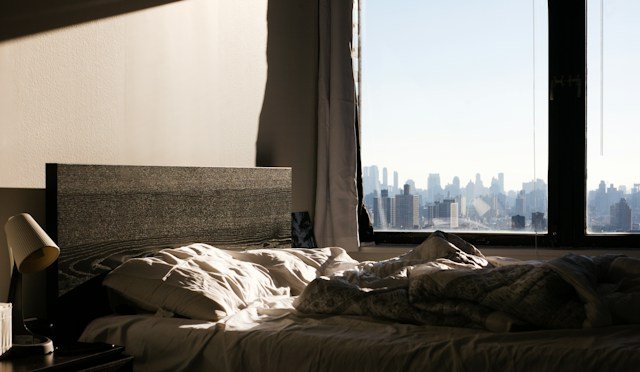
The zone that benefits most from restraint is sleep. It is tempting to use the space around the bed as extra storage because it is right there, but a calm bed area is a large part of why a studio feels like a home rather than a single crowded room. Try to leave at least the wall behind the bed and the floor space beside it free of anything that is not directly part of sleeping.
Furniture that earns its footprint
In a studio, furniture is the biggest lever you have. A single oversized sofa can consume a third of the usable floor. The trick is to judge every large piece by what it gives back relative to the space it takes, and whether it can do more than one job without making the room feel like a puzzle.
Here is a rough way to think about the pieces most studios have to decide on. None of these are rules. They are questions to ask before you commit floor space to anything.
| Piece | What to look for | Watch out for |
|---|---|---|
| Bed | A simple frame with open space or tidy storage underneath, and a headboard that does not stick out far. | Tall, chunky frames and bulky footboards that cut off the room. |
| Seating | One compact sofa or loveseat with slim arms and exposed legs, so you can see floor beneath it. | Sectionals, deep recliners and anything that pushes you to add a second set of chairs. |
| Table | A small table that can seat two but works for one, ideally one that can fold or extend. | Large dining tables that are only used twice a month. |
| Storage | Closed cabinets or boxes on the lower half of the wall, one open shelf above for things you love. | Open shelving everywhere, which turns every belonging into decoration. |
| Desk | A narrow surface with room for a laptop, a lamp and a notebook, nothing more. | A desk that doubles as a permanent filing system. |
Notice a pattern: the pieces that work best in a studio tend to be lighter in both weight and appearance. Furniture on slim legs lets you see the floor under it, and a visible floor reads as more space even when the room is the same size. Low furniture along the walls keeps the upper half of the room open. A single tall piece, such as a narrow bookcase or a wardrobe, can anchor a wall far better than a bunch of short pieces scattered at different heights.
A quick test for any new piece
Before bringing something large into the room, mark its footprint on the floor with painter’s tape, and leave it there for two days. Walk around it. Sit where you would sit. If the tape is annoying after forty-eight hours, the real thing will be worse.
Light is the cheapest square footage
Many studio apartments have exactly one or two windows, and how you treat them matters more than almost any other decision. A window that is half covered by a heavy curtain, a stack of plants and a bookcase is a window you have paid for in rent and then decided not to use.
Start with the simple things. Pull curtains fully to the sides during the day so they sit on the wall rather than across the glass. Choose sheer or light-filtering fabrics in a pale color so that daylight spreads into the room instead of stopping at the glass. Keep the sill clear or nearly clear, with one object at most.
Then think about the evening. Most studios depend on a single overhead light, which flattens the room and makes everything look like an office. Two or three small lamps at different heights, placed in different zones, do far more for atmosphere. A lamp by the bed, a lamp near the sofa and a small task light at the desk let you light only the area you are using and let the rest of the room fall quietly into shadow. That is a surprisingly effective way to make a one-room home feel like it has separate rooms.
Mirrors, used on purpose
A mirror placed across from or beside a window bounces daylight deeper into the room and gives a sense of depth. A mirror placed across from a messy corner doubles the mess. Look at what a mirror will reflect before you hang it, and choose a spot where the reflection is something you want to see twice.
A quiet palette: three colors and one texture
Visual calm in a small space comes from repetition. If the walls, large furniture and textiles all sit in the same narrow range of colors, the room reads as one soft block instead of a dozen competing objects. A simple way to hold yourself to that is the three-color rule: one light base color for walls and big surfaces, one mid-tone for larger furniture and textiles, and one deeper tone for a few anchoring objects. Then add a single accent, in small amounts, for a bit of life.
One example proportion. Swap in whatever colors you love, but keep the base large and the accent small.
The texture rule works the same way. A minimalist room with only smooth, flat surfaces can feel cold. Choosing one texture to repeat, such as linen, light wood grain, wool or woven baskets, adds warmth without adding visual noise. You do not need many materials, you need the same two or three in several places.
This is also where plants can help. One or two healthy plants in a room do far more than a shelf of small ones, because a single plant reads as a deliberate choice and a crowd of them reads as a collection. Put the larger one on the floor beside the window and let it be the only green thing in that corner.
What to do about the bed
The bed is the hardest object in a studio, because it is the biggest, it never goes away, and it has an emotional job to do at night that conflicts with its visual job during the day. There are a few approaches that tend to work well, and the right one depends on the shape of your room.
If the room is wide enough, placing the bed in an alcove or against the far wall and treating it as its own corner works nicely. A bookcase or a tall plant at its foot can act as a soft divider. If the room is narrow, running the bed along the long wall frees the middle of the floor, even though it makes the bed more visible. In that case, a well-made bed with simple bedding in a color that matches the wall becomes a quiet background rather than a bold statement.
Whatever the layout, the daily habit matters more than the furniture. A bed that is made takes about a minute and changes the look of the entire room. The surface of an unmade bed reads as dozens of folds and shadows, which is the exact kind of visual noise a minimalist room is trying to avoid. A flat cover, one or two pillows and perhaps a folded throw at the foot is plenty.
Walls and the “float” rule
Floor space is limited, wall space often is not. Moving things up and off the floor is one of the more effective ways to make a studio feel larger. A wall-mounted shelf instead of a floor bookcase, a hook rail instead of a coat stand, a lamp mounted to the wall instead of one taking up a side table, each of these hands a bit of floor back to the room.
The caution here is that walls fill up as fast as floors do. A wall covered edge to edge in frames and shelves is just clutter at eye level. Keep the principle of one clear zone per wall. If one wall holds the shelving, keep the next one almost bare. If the bed wall has art, keep the opposite side calm. Leave at least a quarter of any wall completely empty so that the eye has somewhere to rest.
If you rent, check your lease before drilling. Many landlords allow a few small holes, and plenty of lightweight options, such as adhesive hooks and leaning mirrors, work without any at all. Leaning a large mirror or a piece of art against the wall instead of hanging it often looks better in a minimalist room anyway, since it feels relaxed rather than arranged.
Visual noise: before and after
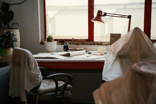
Minimalism in a small room is mostly about reducing visual noise, which is the sum of every small object, color change and pattern your eye has to process. You can often get 80 percent of the calm you are after not by removing belongings, but by changing how they are stored and displayed. Compare these two versions of the same room.
Busy version
- Open shelves holding everything, from books to bags to cables
- Five or six different colors in cushions, throws and art
- Items stacked on the floor beside the sofa
- Small decorative objects on every flat surface
- One bright overhead light and nothing else
Calm version
- Closed storage for practical things, one open shelf for favorites
- Two or three colors, repeated across the room
- Floors clear apart from the rug and furniture legs
- Three or four objects on a surface, grouped with space around them
- Two or three lamps at different heights, used in the evening
You will notice that none of the changes on the right-hand side require getting rid of your belongings. They require giving belongings a place that is not the open air. A closed box holds the same things as an open basket, but the room looks quieter because you cannot see them.
One habit worth keeping is the “group of three” approach to display. When you put a few objects together, odd numbers tend to look more natural than even ones, and leaving clear space around the group lets each item read as chosen. A candle, a small plant and a book on a side table feels composed. Seven small things scattered across the same table feels like clutter, even if each item is individually lovely.
Three weekends, not one marathon
It is tempting to treat redesigning a studio as one big weekend project, but that usually ends with a tired person, a room in chaos and a sense of failure by Sunday night. Spreading the work over three smaller sessions is gentler, and it gives you time to live in the room between steps and notice what is still bothering you.
-
Weekend one: clear and measure
Draw the floor plan, measure the room, and pull everything out of the open and into boxes or bags by category. Do not decide anything yet. Just see what you have and notice which category takes up the most room. Donate or recycle what you already know you do not use.
-
Weekend two: set the zones
Move the big furniture to match your four zones. Live with the new layout for a few days before adding anything back. Pay attention to where you naturally drop things, and where you keep bumping into furniture.
-
Weekend three: put things back, slowly
Return items to the room with a home for each one. Add light, a rug if you want one, and a few finishing touches. Whatever is still in a box after a month probably does not need to come back.
Mistakes that quietly make a studio feel smaller
Most of these are easy to fix once you know what to look for. They tend to creep in slowly, one reasonable decision at a time, until the room feels heavier than it should.
- Pushing everything against the walls. It seems logical, but a room with every piece shoved to the edge looks like a waiting room. Pulling a sofa a few inches from the wall, or angling a chair, can make the room feel more intentional.
- Buying furniture for a bigger imaginary room. It is easy to fall for a piece in a store and forget your floor plan. Always compare against your measurements first.
- Hiding behind a heavy curtain. Thick dark curtains eat the light and shrink the visible space. Keep them light, and keep them open.
- Letting the desk become a storage shelf. If the surface is full at the end of the day, the work zone has quietly absorbed the room’s clutter. Clear it at the same time every evening.
- Using many small storage pieces. Several little containers look busy. Fewer, larger ones in the same color are calmer.
- Overlooking the floor. A rug that is too small makes furniture look like it is floating. A rug that fits at least the front legs of the sofa pulls a zone together.
- Treating minimalism as a contest. There is no prize for the emptiest room. If something makes you happy and has a spot, it belongs.
Keeping it calm after the first month
The initial reset is the easy part. What matters is the quiet routine that keeps the room from drifting back. Two or three small habits are usually enough, and they should be small enough that you can do them while tired.
One is the evening pass: a two-minute walk around the room before bed, putting things back in their homes and clearing the table and desk. Another is the one-in, one-out habit for things that tend to multiply, like books, mugs, throw pillows and shoes. When something new arrives, something similar leaves. A third is a short monthly look at the room with fresh eyes, perhaps while sitting in each zone for a minute, noticing anything that has crept in and does not belong.
You may also find that the room needs a small seasonal change to stay interesting. Swapping a throw, changing a cushion cover or moving a plant to a new spot gives a sense of variety without adding anything to the room. This is one of the quiet advantages of a minimalist space: because there is so little in it, even small changes feel noticeable and fresh.
What this adds up to
Studio apartment minimalist design is not a particular look. It is a way of making decisions: choosing a place for each activity, letting furniture earn its footprint, giving light room to move, keeping a small palette and putting belongings away in a way that lets the room breathe. When those pieces line up, a single room can feel surprisingly roomy and, more importantly, easy to live in.
You do not have to do all of it at once. Draw the floor plan this week. Pick one zone to fix. Move one lamp. Make the bed tomorrow morning. Small changes in a small space add up quickly, because every change is visible the moment you look up from where you are sitting.
Frequently asked questions
How do I make a studio apartment look minimalist without throwing everything away?
Focus on where things live rather than how much you own. Moving belongings into closed storage, grouping what stays on display and clearing floors and surfaces creates most of the calm look. Decide what to let go of only after you see what is left in the open.
What is the best layout for a small studio apartment?
There is no single best layout, but a good one usually puts the bed as far from the entrance as possible, the work area next to the window, and the eating area near the kitchen. Leave a clear walking path from the door to each zone.
How can I separate sleeping and living areas without walls?
Use furniture orientation, a rug, a low open bookcase or a plant to mark the boundary. Lighting also helps, since a lamp by the bed and a different one in the seating area make each part of the room feel distinct.
Which colors make a small studio feel bigger?
Light, warm neutrals on the walls and large surfaces tend to bounce light around and keep the room open. Keeping the palette narrow, with larger furniture in similar tones, also helps the room read as one calm space rather than several competing areas.
Can I use bold colors or patterns in a minimalist studio?
Yes, in small doses. One patterned cushion cover, a single piece of art or a colorful rug can give the room character. The key is to limit it to one or two accents so they stand out rather than compete.
How many items should be on a table or shelf?
There is no exact number, but groups of three or so with clear space around them look composed. If a surface looks busy, remove a few items rather than rearranging them all.
How do I stop a studio from getting cluttered again?
Give every item a home, do a short evening pass to reset the room, and follow a simple one-in, one-out habit for things that multiply. A brief monthly look at each zone catches clutter before it spreads.

Written by Rayhan Kobir Rayhan writes practical, calm guides about home, routines and everyday living at LifeWise Journal. This article shares general ideas and personal-style suggestions, not professional interior design, structural or safety advice. If you rent, always check your lease before making changes to walls or fixtures.